

Economic models must be presented to students in one or more of the following four ways: verbally, with tables, with algebraic formulations, or with graphs. Combining two or more of these adds to students' ability to learn the lessons we wish to teach. We have concluded that Microsoft Excel provides an excellent medium for combining the tabular, algebraic and graphic formulations of our models. Even verbal representation can be facilitated by the insertion of comments into cells and text boxes into the worksheets. Among its many advantages, it allows instructors great latitude in combining these modes of representation: in beginning courses, graphs and tables may be brought to the fore, with algebra hidden, while in more advanced courses, students may examine the mechanics of quite complex models within spreadsheets. The advantages of spreadsheets have been stressed (Cahill and Kosicki, 2000, p. 770; Mixon and Tohamy, 1999, p. 4).
This paper shows how spreadsheets can be used to help students learn the material in a Principles of Economics course. It does this by exhibiting a selection of worksheets that we have employed and describing how each worksheet is used in the course. Before looking at individual sheets, however, we briefly review the evolution of this project.
Two years ago, we began to collaborate on an effort to represent some of the models used in international trade in Excel workbooks (Tohamy and Mixon, 2000). Student response indicated that the project was a mixed success, largely because of problems due to too-rapid an execution. We judged that the approach had considerable potential for success and worked throughout the spring and summer of 1999 to incorporate the approach into a Principles of Microeconomics course.
To make the workbooks accessible, we followed our textbook (Mankiw, 2001) quite closely. Indeed, we replicated every graph in the chapters covered in the course. This approach allows students to look at the text at the same time they are working through problems. One student's comment on our end-of-term review was that the workbooks 'forced' him to work systematically through the text, a benefit that we had not anticipated. Though he used the word 'forced' he praised the workbooks, seeing this coercion as valuable. (We asked students to indicate their gender on the review instrument.)
In general, we are most encouraged by the end-of-term reviews. Despite the glitches that invariably accompany first-time efforts and despite the fact that these exercises constitute a significant amount of additional work on the students' part (reportedly, about 30 minutes per chapter), the overall response to content and effectiveness questions was in the neighborhood of 4.0 out of 5.0 points.
The remainder of this paper shows three examples of how Excel can effectively illustrate economics principles to students. The first represents the most basic of models, competitive market equilibrium, and shows the effect on such a market of an excise tax. The second shows the analysis of a tariff imposed by the government of a small country. This is one of the more involved graphs in the set that we have developed. The third example depicts an open macroeconomy, combining the asset market and the market for foreign exchange. This example shows how more than one graph can be combined for an effective representation.
A staple of introductory economics is using the tools of demand and supply to show the effects of an excise tax. Analysing such a tax allows instructors to show how forces of demand and supply work to distribute the cost of such a tax among buyers and sellers, irrespective of the explicit mandates of legislators. It also shows 'deadweight loss' incurred when taxes are raised. The benchmark is a market free of taxes or subsidies. Figure 1 shows how such a market results in surplus to both consumers and producers. Subsequent sheets (not shown below) show that a higher price or a lower price can increase the surplus of one of the groups but that the total surplus is reduced.
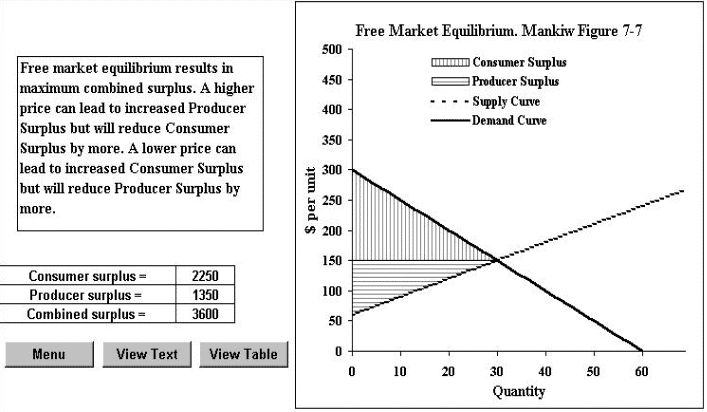
Figure 1 The efficiency of free market equilibrium
(Click to see full size image)
Figure 2 is part of a workbook that examines various aspects of excise taxes. Preceding this particular sheet are sheets showing that the actual incidence of the tax is independent of the legal incidence. This sheet is succeeded by others that show the efficiency and revenue implications of higher taxes, including a development of the 'Laffer curve'.
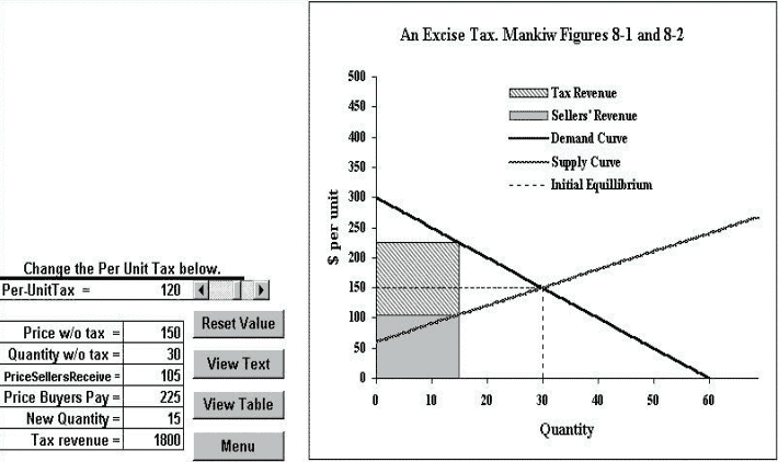
Figure 2 An excise tax
(Click to see full size image)
This figure exhibits a number of aspects of our use of Excel. An obvious feature is that the student can change the per-unit tax rate (in this sheet, using the scroll bar) and immediately see the effects on prices paid and received, on quantity, and on tax revenue. These values show up in two forms, as numerical values in the table and in the graph to the right of the table. This worksheet does not explicitly address the efficiency-reducing aspect of the tariff (others do), but the 'deadweight loss' is easily identified by comparing the area in Figure 1 with that in Figure 2.
Along with the scroll bar that facilitates changing of the tax rate are four other buttons. (Using the scroll bar rather than having students enter dollar amounts has an added advantage. The instructor can limit the tax rates to those for which data are available in the spreadsheet. If, for example, a student entered a tax rate of $117, the lines and areas in the graph would not quite mesh with the information implied by the demand and supply curves.) The 'Reset Value' button is self-descriptive. The 'View Text' button takes the user to a text box containing pertinent material from the text. The 'Menu' button takes the user to the first sheet of the workbook. This sheet contains descriptive matter and a set of navigation buttons to take the user to other sheets.
The 'View Table' button is especially useful. It takes the user to the tabulated values of the variables represented in the graph. An important advantage of a spreadsheet is that the user can see both tabular and graphic representations of the same relationship. Unfortunately, screen size precludes having both a clear graph and a complete table in view at the same time. This button (and a counterpart 'View Graph' button at the table) allow quick navigation to facilitate comparison.
Excel is quite versatile in allowing various ways to represent data. This workbook, like many, mixes line graphs (demand curve, supply curve, equilibrium values) with area graphs (tax revenue, sellers' revenue and total spending-the sum of the preceding). This great advantage comes with a cost, however: the horizontal axis must consist of integer values starting at 1. Excel's 'scatter plot' (which actually allows lines, points or both) allows any positive or negative values for the variables. Accordingly, where area is not required, we favour that type of graph. (A trick of the trade: we create the line 'Initial Equilibrium' by using a logical statement such that when Q < 30, the variable's value is 150; otherwise, it is a large negative number. This makes the function appear to drop vertically at the critical value of Q.)
While arguments about international trade are not typically won on the basis of efficiency (Roberts, 2000), this remains an important lesson to teach. Figure 3 contains all pertinent information from the standard analysis of a tariff. It shows how much the country's consumers and producers could gain as a group from free trade, how much producers gain and consumers lose due to a tariff, how much revenue the tariff generates, and how much inefficiency (deadweight loss) the tariff generates.

Figure 3. Effects of a tariff
(Click to see full size image)
For the purpose at hand-demonstrating Excel's potential for representing economic relationships-we include this mainly because it is so complex. The combination of area and line charts is much like that in Figure 2. What is apparent here, however, is how much can be accomplished by judicious layering of the various area graphs. This does, of course, require considerable effort. The formula for each area must be defined; often these formulas involve logical statements. Even so, we find the results gratifying. (The legend is suppressed here to avoid undue clutter. It can be added.)
This example involves a topic that is typically not considered part of a Principles of Microeconomics course. We find that we can review the basic concepts of open-economy macroeconomics (Mankiw, 2001:ch. 29) and then apply the same analytical model that we have previously used to address the question of how a free market system integrates the domestic economy with the rest of the world.
In doing this we develop a four-sheet workbook. Each sheet develops a portion of the model. First, the simple macroeconomic (savings = investment) model is reviewed. Then the special role of net foreign investment is developed. A third sheet introduces and analyses the demand for foreign exchange. Then the sheet shown in Figure 4 puts it all together.
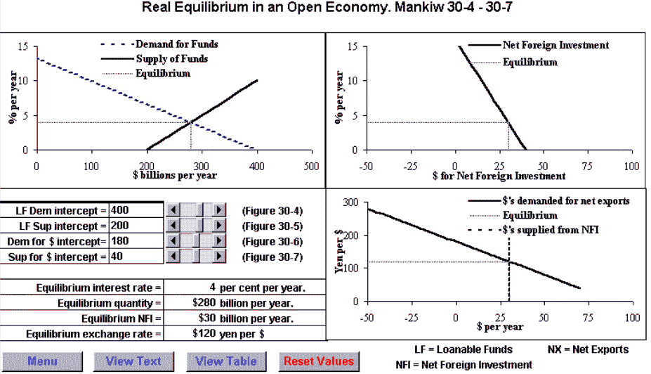
Figure 4 Foreign exchange market
(Click to see full size image)
When drawing a composite figure like Figure 4, one relies on Excel's excellent graph-alignment feature. Each of the three graphs is drawn, making sure that the dimensions are the same in each. Then the top two figures are aligned horizontally, and the two figures on the right are aligned vertically. The result is a summary of the model in which the student can shift loanable funds demand or supply, the demand for dollars for net foreign investment (which can be negative and which generates the supply of foreign currency, which also can be negative) and the demand for foreign currency. The references to Figure 30-4, etc., are to figures in Mankiw's text. Each of these figures is also represented as a spreadsheet in this workbook, allowing students to engage in comparative-statics exercises at each step toward building this general model.
We have integrated Excel workbooks into a Principles of Microeconomics course. The degree of integration is quite significant and is increasing. We have already replicated every graph in the chapter of the text that we use in our course as an Excel graph and have developed assignments for students as exercise sets/study guides. We have also collected student feedback on individual workbooks and on the overall approach. In addition, we have used the workbooks as part of classroom lectures. This integration is a process. In particular, we hope to incorporate more fully the 'real time' analysis capabilities of the spreadsheets into our classroom presentation.
An advantage of using Excel rather than pre-packed 'black box' materials is that we can make changes whenever we find reasons to do so. We have made a few changes in response to student comments. Usually these involve correcting errors, but suggestions for changes that simply improve presentation have also resulted in some minor revisions. With this in mind, we welcome suggestions from readers.
Cahill, Miles and George Kosicki (2000) 'Exploring economic models using excel' Southern Economic Journal, vol. 66, no. 3 (January), pp. 770-92.
Mankiw, Gregory N.(2001) Principles of Economics, (2nd edn), New York: Harcourt College Publishers.
Mixon, J. Wilson, Jr; and Soumaya Tohamy (1999) 'The Heckscher-Ohlin model with variable input coefficients in spreadsheets', CHEER, vol.13, no.2 (November), pp. 4-6.
Roberts, Russell (2000) 'Speaking about trade to an open-minded skeptic', Cato Journal, vol.19, no. 3 (winter), pp. 439-48.
Tohamy, Soumaya and J. Wilson Mixon, Jr (2000) 'Using Microsoft Excel to illustrate gains from trade', Business Quest, http://www.westga.edu/~bquest/2000/excel.html .